Haven't done any drawing today. Just took some photo ref and did some lettering for Seven Psychos, nothing worth showing there.
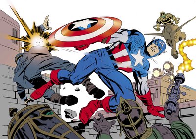
I did get around to colouring that Kirby piece I tried inking last month. The colouring was much more difficult than the inking. I tried to keep it really flat, any modelling just looked weird over those stylised forms.

It has a real Steve Rude feel to it, in a good way.
ReplyDeleteHave you thought about seeing if Marvel would be interested in you inking that lost FF issue they're putting out? That'd be gold!
Looks good to me :)
ReplyDeleteI'm unconvinced about this lost FF comic - Joe Q started talking about putting modern rendered colours on it, and I went "woah, neddy!" Those trade paperbacks withe the rendered colours look awful. For a modern, yet flat, approach, I'd give the job to that guy currently colouring Joe Casey's GODLAND: Bill Crabtree.
ReplyDeleteGood idea Mark. Keep it flat on the figures with some subtle grads in the background.
ReplyDeleteBill Crabtree would be great, he does some nice work on Joe's book.
Now all we've gotta do is convince that nice Mr Quesada.
ReplyDeleteAnd in INVINCIBLE, one nice colourist.
ReplyDeletecompletly off-topic, was reading User today, and loved the art, and color, it looks like it was a painted work.
Loved the atmosphere it created.
Wich means, like the Kirby homage, but prefer the original Sean ;)
My pages in User were produced totally digitally, mostly in Painter with some Photoshop to tweak a little.
ReplyDeleteIf I'm honest, I still like a lot of the 'flatter' approaches to comics colouring than some of the more rendered ones, though it may depend on the artist that the colourist is working with - for example, Laura Allred's colouring on Mike Allred's work looks fantastic, though his work could be out of the 60s too.
ReplyDelete